Pastel pink and blue go beyond the baby’s room
Local interior designers offer guidance on making rooms pop with Pantone’s latest spotlighted hues
Step aside, Marsala—2016 is well under way, and it’s time to embrace Pantone’s latest spotlighted hues. This year, Rose Quartz, a cotton-candy pink, and Serenity, an airy powder blue, share the international pigment authority’s coveted colour-of-the-year title. But if those shades conjure flashbacks of bathrooms tiled wall to wall in pink ceramic or vinyl-padded chairs covered in sickly blues, don’t fret: the pastels have come a long way from their space-age past.
“The combination is really quite fresh,” says Vancouver interior designer Ami McKay in a phone interview. “With where design trends have been for a while and with the whole Scandinavian movement, these little infusions of colour are really lovely.”
To prevent your space from looking too wedding- or nursery-like, McKay, the design maven behind PURE Design, recommends incorporating the hues through fixtures and décor items rather than drenching an entire wall.
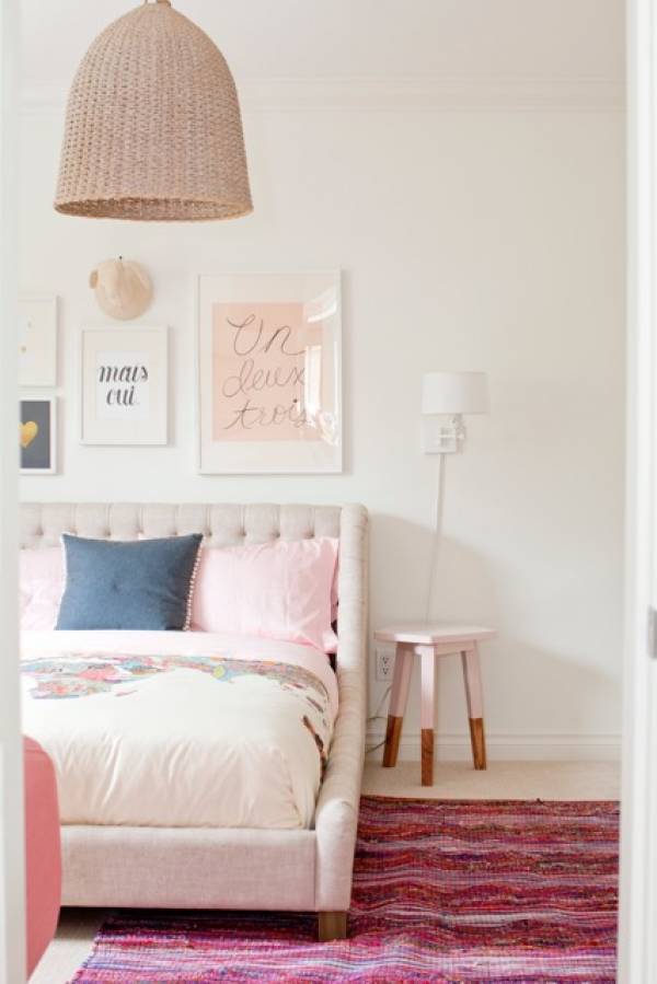
She loves the idea of injecting a clean, white palette with industrial pendant lights coloured in the softness of Serenity or revamping an existing set of dining-room chairs with a fresh coat of the two shades. The pink and blue chairs can be alternated around a table to create a whimsical look.
Vancouver interior designer Dexter Dolores has a similar approach, preferring to pair each colour with contrasting textures and elements. He points out that metals such as iron, steel, and copper give Rose Quartz a stylish edge, while rose-gold accents work particularly well with the more boyish Serenity.
To achieve the complementary scheme, you can reupholster a dark metal-framed chair in a Rose Quartz fabric, marry baby-pink or blue bedding with deep charcoal or grey-toned cushions, or set rose-gold flatware atop powder-blue place mats for a striking tablescape.
“That’s sort of what I like to do with my interiors,” Dolores says, “have something that’s ultrafeminine combined with something that’s ultra-masculine, so that the two kind of play off each other.”
If you’re after a more dramatic feel, McKay and Dolores both note that matching Rose Quartz with black does wonders to tame the almost saccharine shade. Consider colour-blocking black shelving or cabinetry with hits of pink, for example, or placing rose-coated furnishings in front of a chalkboard wall.
But whether you decide to commit to Rose Quartz or Serenity or both, McKay stresses that it helps to ground the dreamy hues with more natural elements. “I think when you add a colour like this—a soft, pastel colour—you need baskets and wicker and jute and raw wood,” she says. “You need to ‘earth’ it and bring it down a bit.”
Think exposed wood legs, caramel leather Moroccan poufs, or potted plants and other greenery that will transform the childlike colours into more modern and adult-friendly décor.
“The goal is to keep it sophisticated and not have it look like a little girl’s room,” McKay says.


Comments